ShopRite of Lodi
Owner: Inserra Supermarkets
Opened: 2007
Previous Tenants: none
Cooperative: Wakefern Food Corp.
Location: 175 Main St, Lodi, NJ
Photographed: May 2016
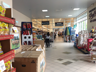
The front end runs along Main Street, so that there can be an entrance and exit at either end. The main entrance is on the south end, which takes shoppers into the grand aisle with the food court, produce, bakery, and liquor. The other entrance takes shoppers into dairy and frozen.
While the exterior design is impressive and a good match for the downtown development, the interior is bland and amateurish in design. From the main entrance, we enter to nothing in particular, as older Inserra stores are fond of. You can turn right for floral, customer service, and pharmacy which like New City are in islands along the front end, or left for bakery, produce, food court, and liquor.
If you turn left upon entering, you will find that all-time favorite combination, Gatorade and salad.
Like Wayne, there's a seating area with nothing to eat except salad.
Liquor to the left of the food court.This grand aisle could be very attractive with some better decor. While well-intentioned, these signs just fall flat and there's way too much blank space on the walls. Seems like they didn't learn from Fair Lawn, which opened 10 years before this one.
Moving closer to the bakery, we see that it is in fact very attractive, just with boring decor.
Looking back up towards the front of the store.
A very odd corner at the back of the produce department, which extends behind bakery. Some of the signs, like this which doesn't even match the rest of the decor, might even be moved over from Hasbrouck Heights.
Deli and seafood, as usual, under the rounded lit ceiling, this one outfitted with a sushi counter facing produce.
Mostly works. These must be a pain to replace lightbulbs in.
Seafood on the left side, and deli on the right side...
Somewhat abbreviated decor here to account for the different ceiling height.
Meat continues along the back wall. I must say, I am a fan of the category markers!
Short grocery aisles to account for the floral, customer service, and pharmacy islands.
Customer service faces the pass-through to the grocery aisles, instead of the front end. Pharmacy faces the front end.
Moving back to the rear wall of the store...
Milk and juice on the back wall, with no signage whatsoever.
The rest of the dairy department, which lines both sides of the last aisle, looks much better.
Moving on to the front corner of the store, we have an inexplicably enormous frozen foods department, with more space than could ever possibly fill up.
And now, the front-end in front of the customer service and pharmacy islands...
I must say, although I'm not a huge fan of the Inserra stores, they are always clean (if not well organized -- but that's only because they do an enormous sales volume). And their prices are always quite good, so like any other supermarket, there are positives and negatives.
But as I was leaving, this sign did catch my eye. It's a nice touch, and certainly makes this enormous superstore feel a little more personal.
We're getting close to the end of Bergen and Passaic! We have a few more stores to the east, across the Hackensack River, including one more Inserra ShopRite. Our next store is a Look Inside tomorrow on The Independent Edition!


While that sign is a nice gesture toward their customers, its haphazard capitalization is killing me.
ReplyDeleteI don't Have any Idea What you could Mean.
DeleteThe main department signs are uncannily similar to Albertsons Grocery Palace décor. On the other hand, that thank you sign is one of a kind. Very nice.
ReplyDeleteDefinitely -- Grocery Palace's simpler, uglier counterpart.
DeleteThere seems to be more variety in the shopping carts than there is in the decor. Though I do find that rounded light-up ceiling just as interesting.
ReplyDeleteCertainly! That's a feature that was in a lot of the Inserra stores of the 90s and 00s.
DeleteFun fact: this store was in the works for much of the prior five years, but it was on the site of a factory that blew up and the remediation took forever.
ReplyDeleteAs remediation typically does!
DeleteOh yeah. And this was particularly ugly.
Delete