ShopRite of Wayne Hills
Owner: Inserra Supermarkets
So that means that the ShopRite is bringing some much-needed life to this mall. It does also mean that Plaza Square, where the ShopRite was formerly located, is now quite desolate. I wouldn't be surprised if LIDL were interested in moving into part of the former ShopRite.
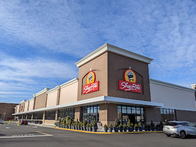
The entrance to the store is located in the corner under the logo to the right. Now as much as I do find this exterior attractive, I must wonder why the signage is so minimal. Judging by the other tenants of the mall and neighboring retail, there aren't zoning laws that prohibit a lot of signage. And I'm wondering why there wasn't a sign of just the text of the ShopRite name in that panel that's blank in the middle.
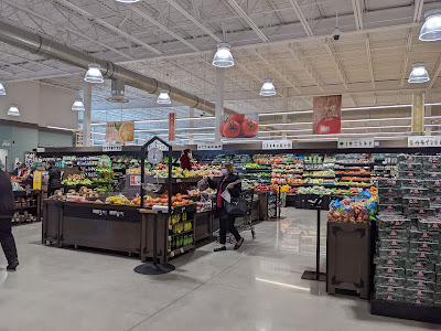
We enter the store to a very spacious grand aisle with produce on the left side. Floral and a cafe are in the front, with prepared foods and deli lining the right-side wall. Bakery and seafood/sushi are at the back of the grand aisle, with meat continuing across the back wall. HABA and then frozen/dairy are at the left side of the store. Unlike the old ShopRite, believe it or not, this store does not have a pharmacy. (Inserra, I recently realized, no longer has any pharmacies in their stores.)
I would say this is one of the better efforts by the Broden Design Group for a ShopRite operator. The decor is really exciting and it's a variation on what we've seen at other new Inserras, such as West Milford, Hillsdale, and Wyckoff. (Hillsdale is a slightly older variation on this decor package.)
Customer service is on the front wall to the left.
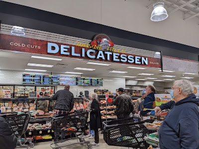
Prepared foods and then deli are up next on the right side of the store. What an upgrade from the old store!
I'm sure the mirrored panel on the top of the deli sign is not an intentional reference to the old Wayne ShopRite's ridiculous floral department, but it would be funny if it's an inside joke the designers threw in.
Inserra has drastically improved their bakery program recently. In fact, I would say that Inserra has really substantially improved their stores overall in the last five years or so. Their oldest stores are still rather unappealing, but their newest stores are as good as the best of Village or Glass Gardens -- or better, even.
I remember when I first visited Inserra stores years ago (I think the rather awful Jersey City one was my first, followed by the equally awful Hackensack -- which was before I started photographing stores and I have not been back since). I couldn't believe that these stores had the same name on the front as my local wonderful Village stores. But since then my perception has really changed -- and so have the stores, of course.
A look across the back wall. The one thing I will say is that the old store had a certain cozy feeling inside that this one, very obviously, lacks. That may turn off some customers but this store was quite busy at the time of my visit, so clearly it's not a big problem.
Here we have the back of the produce signage in the first grocery aisle.
The one thing I will say about this and many newer stores is that the lighting is not exciting. It's just designed for general illumination rather than effect, although there are some exceptions such as this lighting below the seafood counter...
Very cool! And the supermarket overall has a very bright and airy feeling, partially because of the lighting (and windows), but partially because of the high ceiling...
Service butcher and in-store aged meats on the back wall.
I love the attention to detail here, such as the category markers done in the shape of butcher cleavers.
And a look across the back wall of the store towards the first aisle.
As we've seen in the newer ShopRite stores, HABA is in special lit shelving. Great effect in person, which does help add visual interest to the lighting...
An aisle and a half of frozen at the far left side of the store, and then we have dairy in the last aisle.
I do not think this decor is nearly as impressive as what we see in the grand aisle and the rest of the perimeter. It looks a little childish, more like clip art than custom designed decor.
Dairy continues on the front wall of the store as we move into the front-end...
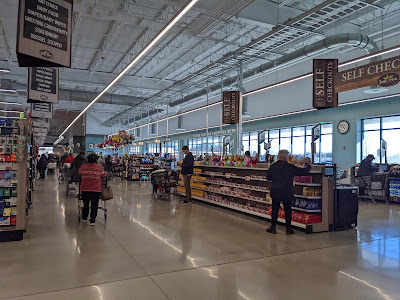
Self-checkouts here at this end, with the rest being regular service registers. There are also a few self checkouts in a traditional register style for people with larger orders. I remember seeing those at Pathmark, but not too many other places.
Owner: Inserra Supermarkets
Opened: October 31, 2021
Previous Tenants: on site of former Wayne Hills Mall
Cooperative: Wakefern Food Corp.
Location: 30 Wayne Hills Mall, Wayne, NJ
Photographed: December 2021
We arrive at the Wayne Hills Mall in Wayne, NJ to check out the brand-new Wayne Hills ShopRite! As much as I am sad to see the ancient -- and totally unique -- Wayne ShopRite just west on Hamburg Turnpike close up shop, its replacement about a mile and a quarter northwest is beautiful. The 80,000 square foot store is located on what used to be the indoor mall portion of the Wayne Hills Mall, which was demolished. The mall also includes a Burlington Coat Factory to the left of the ShopRite, a vacant Toys R Us and Kmart across the parking lot, and an LA Fitness in a former Pathmark. The ShopRite opened on Halloween 2021.So that means that the ShopRite is bringing some much-needed life to this mall. It does also mean that Plaza Square, where the ShopRite was formerly located, is now quite desolate. I wouldn't be surprised if LIDL were interested in moving into part of the former ShopRite.
The entrance to the store is located in the corner under the logo to the right. Now as much as I do find this exterior attractive, I must wonder why the signage is so minimal. Judging by the other tenants of the mall and neighboring retail, there aren't zoning laws that prohibit a lot of signage. And I'm wondering why there wasn't a sign of just the text of the ShopRite name in that panel that's blank in the middle.
We enter the store to a very spacious grand aisle with produce on the left side. Floral and a cafe are in the front, with prepared foods and deli lining the right-side wall. Bakery and seafood/sushi are at the back of the grand aisle, with meat continuing across the back wall. HABA and then frozen/dairy are at the left side of the store. Unlike the old ShopRite, believe it or not, this store does not have a pharmacy. (Inserra, I recently realized, no longer has any pharmacies in their stores.)
I would say this is one of the better efforts by the Broden Design Group for a ShopRite operator. The decor is really exciting and it's a variation on what we've seen at other new Inserras, such as West Milford, Hillsdale, and Wyckoff. (Hillsdale is a slightly older variation on this decor package.)
Customer service is on the front wall to the left.
Prepared foods and then deli are up next on the right side of the store. What an upgrade from the old store!
I'm sure the mirrored panel on the top of the deli sign is not an intentional reference to the old Wayne ShopRite's ridiculous floral department, but it would be funny if it's an inside joke the designers threw in.
Inserra has drastically improved their bakery program recently. In fact, I would say that Inserra has really substantially improved their stores overall in the last five years or so. Their oldest stores are still rather unappealing, but their newest stores are as good as the best of Village or Glass Gardens -- or better, even.
I remember when I first visited Inserra stores years ago (I think the rather awful Jersey City one was my first, followed by the equally awful Hackensack -- which was before I started photographing stores and I have not been back since). I couldn't believe that these stores had the same name on the front as my local wonderful Village stores. But since then my perception has really changed -- and so have the stores, of course.
A look across the back wall. The one thing I will say is that the old store had a certain cozy feeling inside that this one, very obviously, lacks. That may turn off some customers but this store was quite busy at the time of my visit, so clearly it's not a big problem.
Here we have the back of the produce signage in the first grocery aisle.
The one thing I will say about this and many newer stores is that the lighting is not exciting. It's just designed for general illumination rather than effect, although there are some exceptions such as this lighting below the seafood counter...
Very cool! And the supermarket overall has a very bright and airy feeling, partially because of the lighting (and windows), but partially because of the high ceiling...
Service butcher and in-store aged meats on the back wall.
I love the attention to detail here, such as the category markers done in the shape of butcher cleavers.
And a look across the back wall of the store towards the first aisle.
As we've seen in the newer ShopRite stores, HABA is in special lit shelving. Great effect in person, which does help add visual interest to the lighting...
An aisle and a half of frozen at the far left side of the store, and then we have dairy in the last aisle.
I do not think this decor is nearly as impressive as what we see in the grand aisle and the rest of the perimeter. It looks a little childish, more like clip art than custom designed decor.
Dairy continues on the front wall of the store as we move into the front-end...
Self-checkouts here at this end, with the rest being regular service registers. There are also a few self checkouts in a traditional register style for people with larger orders. I remember seeing those at Pathmark, but not too many other places.
And looking across the front-end from the other side. Don't forget to see what else we are looking at today here!


I actually, years ago upon hearing about the relocation, suggested Aldi to open in the old ShopRite location upon the opening of the replacement store.
ReplyDeleteThat would make sense, for sure.
DeleteAlso of note: I also asked Ocean State Job Lot to open in the former Kmart space upon its announced closing in 2019.
ReplyDeleteWow, another beautiful ShopRite! The overall atmosphere both here and in the remodeled Bloomfield store is really fantastic. Much less clutter than a typical ShopRite.
ReplyDeleteYou can add North Bergen to your awful ShopRite list. Inserra owned and completely untouched since it opened in the early 2000's. I have no idea why the place has not been remodeled. It's a crazy high-volume store in desperate need of a remodel. I didn't realize the Inserra closed all of their pharmacies, thought just in my area.
Yes -- Wayne is beautiful! So is Bloomfield. Very well run store too. And yes, North Bergen is just awful. I went there exactly once shortly after the North Bergen Food Bazaar opened. Now you've been there, so you know that's a really nice store that is kept up very well (and it does get crowded at times, but still a good experience). And then I went down the street to the North Bergen ShopRite and oh boy, what a shock going from one to the other.
Delete